20101001

what did we want: the quick brown fox


wishlist.

this is too good to not get. typeface recognition game? my cup of tea. 
my communication design friends: this is the kind of thing that gets our hearts beating. it's like having fun and doing what we do best at the same time.

technically it wouldn't be terribly hard to make my own.
"This very attractively finished typographic memory game includes 25 variations of the letter ‘A’, each in a different letter type. Players attempt to find the matching A’s in the same letter type. The player who has the highest number of matching letters wins the game.
Typographic information about the letter is included on the card, and a separate folder provides a general history of the typography. This is an enjoyable and instructive game for graphic designers and anyone who is fascinated by letter types."
created by BIS publishers found via swiss miss

20100924

what did we animate


For my Motion Graphics 2 class this week we were asked to create an imaginary creature of some sort and practice parenting and expressions in Adobe After Effects while animating our creations. What I came up with was a mystical squid-fish-bird-human hybrid of some sort (tentacles, gills, wings, hands respectively) and the resulting 20 second video above of it flying quietly.

I really enjoyed character creation and would love to dabble into it more. Also, nailing parenting and expressions in AE brought me large amounts of satisfaction. Especially since before figuring it out I spent a good 4 - 5 hours not knowing at all what wasn't working.

(Parenting is the act of linking one elements movements to another - think of it as a child following his / her parent. Expressions is the same thing but with the inclusion of some intuitive "extra" movements AE tacks on to the children elements. That's how those tentacles sway without me going in and animating each individual section.)

Hope you enjoyed the video.

20100923

what did we smile because of: Yum Yum London

This video is absolutely great. It makes you smile, is incredibly cute and filled with tiny details. plus you have no idea what's coming.

Which all combines together to make Yum Yum London a studio to watch out for:
"Yum Yum are Beth Algieri and Jonny Plummer, two directors / designers with a common passion for creating new and exciting things."


i'm also in love with this toy series of heroes and villains they recently conceived and are in the works of making available for purchase. i would definitely like to have that octopus sitting on my desk.


no, their illustration style isn't completely unheard of. reminds me in general of the vinyl toy genre and friends with you because of the adorably imagined creatures - but it's all so fun and smiley. check out more images of their work on their flickr or follow them on twitter.

20100922

what did we try not to do


This project THIS YEAR I WILL TRY NOT TO was created by Elliot Scott and Christopher Doyle (two designers I didn't previously know but will now be watching out for) in an attempt to defy the popularity of certain trends on the internet and challenge themselves as designers to do new things. To not just give in to what people are comfortable with and like.


Wholly admirable and I love it for it's truth, humor and the creator's abilities to make fun of themselves. I also feel kind of shamed because even though I recognize the need to break down the typical and expand our collective comfort bubbles...I still love the things that this publication (in a very manifesto way) declares avoidance of.


And I particularly like it when designers include their process (you can view the video on their site, but not embed). It's 28 pages printed on newsprint stock - only 1000 copies and for sale for AUD $10.00 (but plus $5 for shipping to the US)

20100920

what did we feature: my instructable


Wow, so recognition online can make you feel pretty good about yourself. My instructable (which is the post below this one on this blog) was chosen to be featured on the site!

You can find "Put Insightful Text Into Your Life" on the landing page of the site or more prominently in the Living / Art channel.

Thanks Instructables Editors!

20100914

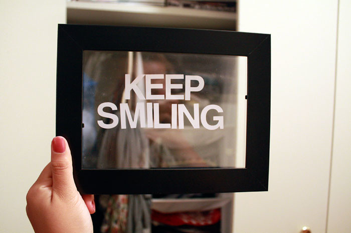
what did we make: words imposed on real life


In my travels across the Internet I invariably come across really meaningful text that someone has come up with superimposed on (typically using the font Helvetica) some very pretty, abstract image of nature, city lights, a beautiful girl or otherwise gentle and mysterious photo. I can’t imagine a better way to fuse the words in your head and the things you see then by putting the two exactly on top of each other to express your deep, throbbing emotions.

Thus I decided I had to have words in real life too. How could anyone know a photo would look nice with text on it unless you were able to test it out first? Here's how you can go about putting words into your everyday lives and make them even more insightful.


All you need are:
- a couple of transparencies
- an Ikea photoframe (or any photoframe) – even multiple photoframes if you like!
- sticker letters. Make sure they’re Helvetica!
- a black sharpie. Your words don’t need color to ooze feeling.
- a pencil and scissors


1. Trace the plastic in your frame on your transparency with a pencil.


2. Have your meaningful insight ready!


3. Using your sharpie or sticker letters express your thought on the transparency however you like.

4. Cut out the transparency, put it in the frame and take as many photos with it as you please. Or just use it to make sure what you’re about to take a photo of really does look good with text placed on top of it. Bonus points for using a DSLR. Extra bonus points for using a lomography camera and then scanning it into your computer. Incredibly extra bonus points for using a polaroid camera to capture your text on the photo.

Now go see your own deep thoughts in reality and imposed on images!


If you like what I had to write on my transparencies you may purchase the set of 5 for the unbeatable price of $10! If you think I’m better at this than you are then drop me an email and I’ll create your own customized set of 5 with whatever words you want!


Check out more photos on Flickr.

20100604

what did we feel compelled by: brian w. ferry


brian w. ferry is a photographer who previously resided in brooklyn and currently lives in london. his photos are fantastically mesmerizing.

i first came across his work on kitsune noir where danica describes his work as the "sort of images that pull you out of the attention deficit disorder-induced habit of compulsive clicking and compel you to pause, inhale and quietly gaze"

i agree entirely and personally think that what makes his photography so compelling is the atmosphere felt within those locations, created by half eaten plates of food and possessions - there is a quiet quality and all the things associated with that word: peace, calm, silence. however, more than being about the presence of these attributes it's the lack of frenzy, clutter and anxiety that pulls me in.

and personal. stockphotos have their place in company quarterlies and as website place holders, but this is the level of intimacy i love. a specific breakfast and someone's weekend trip.

check out his portfolio and find more images on his online journal.