Showing posts with label parsons. Show all posts

20110522

Hazel Santino


Hazel Santino's illustrations are a perfect combination of creepy, mysterious and beautiful. The time each piece must have taken is evident when examined. Hazel's oil paintings are incredibly detailed and tend towards photo realistic; she also incorporates hand done cut outs such as the branches seen in one of the pieces above. Her color palettes are musky, full of neutrals, flesh tones and swirls of greys, a nice contrast to some of the super color saturated illustrative work very popular now. Subjects in her paintings are often human though she also seems to have a enjoy rendering small animals no one else appreciates — rats and pigeons.

The content may be dark, one of the pieces above is based on the story of a murdered girl stuffed into a tree, but Hazel's treatment is far from morose or morbid. There is something quiet and thoughtful in her work. She will be beginning her fifth year at The New School this fall finishing the second of her two degrees there, a BFA in illustration at Parsons and a BA in Literary Studies at Eugene Lang. It seems as though she has already been commissioned for a couple of jobs, CD and book covers, so here's to hoping we see more of Hazel's work recognized.

Hazel's Tumblr

20101216

what did we animate: message received


Message Received from charis poon on Vimeo.
A little girl discovers something magical. (Alternative title: Old School Texting)
Created in Adobe After Effects.

Just completed my Motion Graphics 2 Final. Hurrah! A little sad I won't be taking an animation class next semester — hope I retain my knowledge of After Effects...

20100924

what did we animate


For my Motion Graphics 2 class this week we were asked to create an imaginary creature of some sort and practice parenting and expressions in Adobe After Effects while animating our creations. What I came up with was a mystical squid-fish-bird-human hybrid of some sort (tentacles, gills, wings, hands respectively) and the resulting 20 second video above of it flying quietly.

I really enjoyed character creation and would love to dabble into it more. Also, nailing parenting and expressions in AE brought me large amounts of satisfaction. Especially since before figuring it out I spent a good 4 - 5 hours not knowing at all what wasn't working.

(Parenting is the act of linking one elements movements to another - think of it as a child following his / her parent. Expressions is the same thing but with the inclusion of some intuitive "extra" movements AE tacks on to the children elements. That's how those tentacles sway without me going in and animating each individual section.)

Hope you enjoyed the video.

20100403

what did we wish: where i'd rather be

this is where i want to be instead of in this lab:


doesn't it look amazingly relaxing? mhm. if only.

(all images from graphic-exchange.)

20100331

what did we create: lady gaga's telephone


i have begun learning flash. last wednesday was my first class using the software and then i had two more classes on monday. the learning curve has been high - i've watched a great number of tutorials and scoured the adobe flash cs4 help system plenty but i now have a pretty nifty interface to show for it. click below to give it a go! (i'm banking on everyone having seen the infamous music video by now. the two versions (clean and explicit) currently have a total of 35.5 million views)

20100325

what did we set in type

so the fall semester of sophomore year for communication design students at parsons consists of a lot of typography work. two core classes: type studio and type lab, plus display lettering was my elective so i was basically immersed in a world of type. immersed.

this semester i have no typography classes though i will always believe that alllll design work has to do with typography. hence i don't seem to have seen so much type around.

but here's a post on typography!

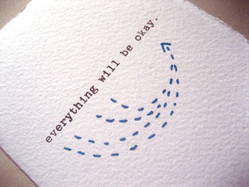
Bread + Butter Card: Everything Will Be Okay

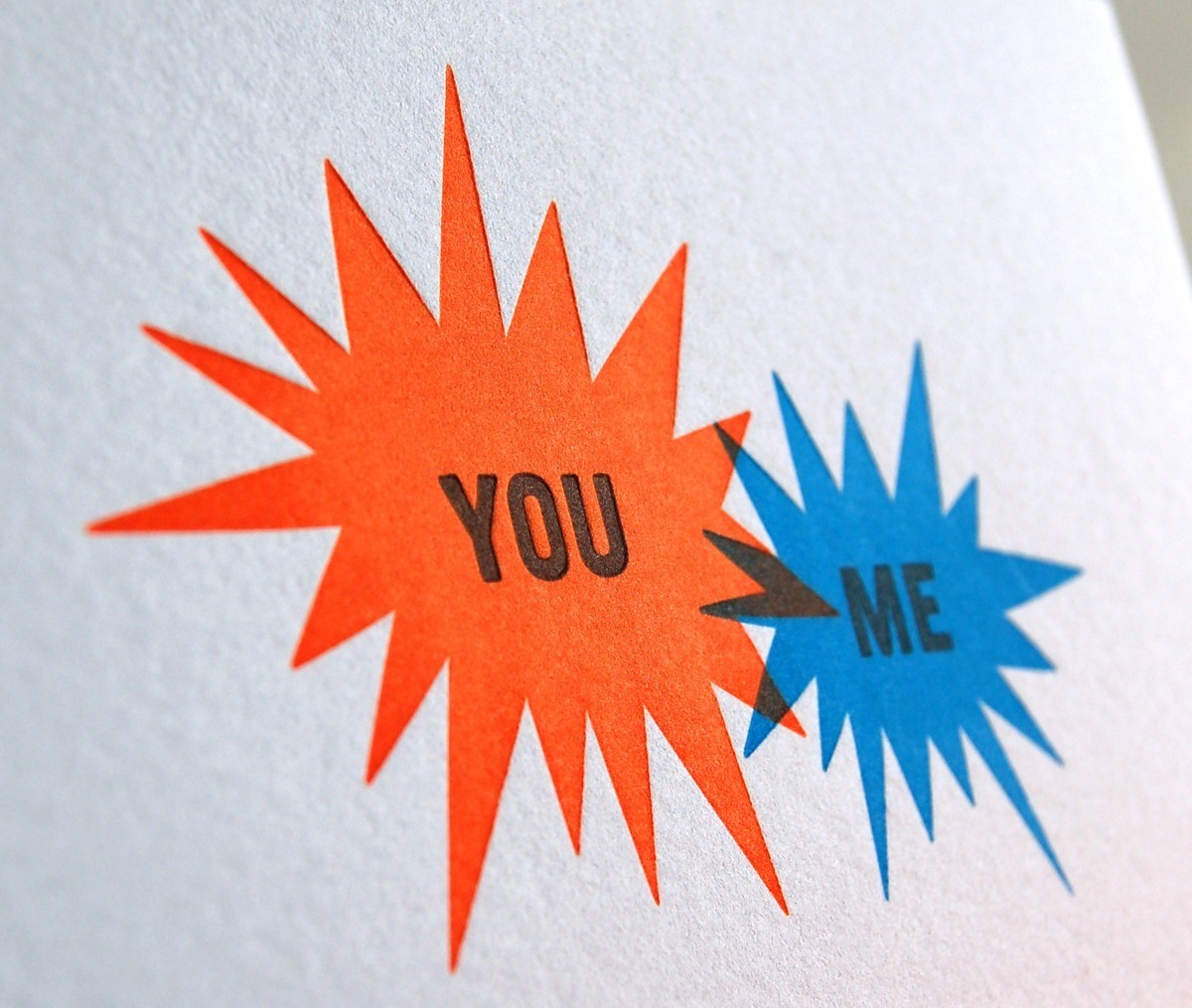
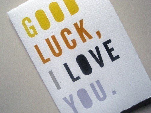
work by bread + butter studio based in brooklyn new york. love their print work.


Bread + Butter Card: Good Luck, I Love You

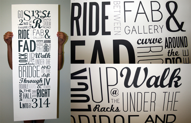
Typographic Map: 13th to 314 by Kristin Bonett

more design: related perusal and i came across this wonderful poster that is a perfect example of well set type using a milieu of typefaces in a very effective manner.
dogs as typefaces by tina roth eisenberg of swiss miss

something my friend geoff wong linked me to randomly. i find it pretty funny though some dogs are more suitable than others. univers, times, eurostile and kunstler are the best to me.

and that's my typography refuel for now.

20100211

what did we attempt


motion graphics assignment number 2: animate the alphabet from A to Z in maximum 70 seconds. use typography found from anywhere and everywhere. be creative. alphabet should grow increasingly abstract as it continues. use audio and work to integrate the motion with the audio well.

this is my first image and from which i'm making all the "A's" drop out and slide off the papers.

*ahem* attempting to make them drop out and slide....

20100204

what did we express interest towards

if you're interested (whoever "you" may be), i updated my online portfolio yesterday after attending the parsons intern fair so that i could send out relevant follow up emails (thank you scot and james for your wonderful advice in the matter) with the link on them.

also: these are the five companies that i talked to, learned more about, expressed my interest towards interning for them. in the order that i talked to them yesterday.

Visionaire "is a multi-format album of fashion and art produced in exclusive numbered limited editions...artists work in collaboration with Visionaire to produce their personal interpretations on a theme and are given unparalleled freedom to push Visionaire's original formats."

BBH and ZAG "the way we work is still shaped by our central belief: that big, enduring ideas are the key to successful communications...so everything we do and all our structures support that single thought."

Hyperakt "is an independent New York City design firm with a passion for creating work that effects change in the world around us."

Stark Design "is an agency that believes in elegant, thoughtful solutions. And we know the best way to communicate clearly and create lasting, powerful messages is through simple, smart design."

Kiehl's "since 1851, our New York apothecary has been dedicated to serving discerning customers fine formulations for skin and hair made with uniquely efficacious, natural ingredients."

20100202

what did we attend


own image

parsons internship fair tomorrow from 10 am to 1 pm at 55 w 13th second floor.

nervous.

20091201

what did we miss: LA


i recently returned from LA this past sunday evening and i still miss it.
partially, thanksgiving break was amazing simply because it was a break away from school, having to work, being on the computer, getting no sleep...stressing out...
but thanksgiving break was also amazing because i was in LA. and because of who i was in LA with.

it was great to get away from NYC. i love new york and i love manhattan still and i think i'm still a city girl - but i have to say that my three semesters at parsons in the city have worn away some of the love for new york. maybe it's just that right now in my life the city is associated with stress. and unending movement.

and LA is only associated with holiday. and good food. and sunny sunny warm weather. (and disneyland, go karting, more good food, dogs, video games, ben and his family...)

so yes. i miss LA and i mostly wish i wasn't here in NY right now. but that's okay. i believe it's alright for me to be in love with more than one city even if it does mean that my heart belongs in some way to four.

images my own - it was also nice to pull out the dslr

20091118

what did we register


today started off alright: registration went well overall. next semester should be exciting.

in other news: why not follow me on twitter? www.twitter.com/whatdidwe

and in more miscellaneous information: these tees are pretty cool. id like one / wear one if given to me / potentially purchase if it didn't cost $30 DIM MAK PAINT BY NUMBER

(oh and i did the header graphic for them for nylon today. NYLON's take. (which is how i heard of) i should put some of those graphics up sometime...)

20091112

what did we...hear?


art of the trench

today while at my phonathon shift i was perusing the above site. a collection of photos taken by the sartorialist (scott schuman) of men, women and children wearing burberry's trench coat. a project in conjunction with burberry solely based on these photos and people commenting on them etc.


cutest photo...

the background music is by the kooks and while i was at work (wearing a headset calling people) i could hear the background music inbetween my phone calls and i was completely confused because it was barely audible and i had no idea it was playing from the site. i told my boss and the girl next to me and the conclusion was that i was crazy. seriously.

not until i closed the window did i realize where it was coming from....


go check it out!

20090925

what did we cheer on

so i know my roommate strongly strongly disagrees with this.
but it was kind of nice not having internet. it was pleasant to not be dependent on it. and to be able to take a break from the constant connectivity, permanent distraction, overflowing information and images that are all what make the internet what it is.

but i did miss blogging. so here i am, trying to blog consistently amidst all of the academics and internship and work and having something of a social life...

(thank you janice for loving polaroids so much.)

here's to fall 2009 (though i'm already a month into the school year) and all it may bring.

20090914

what did we read: the critical of design

while reading a mandatory essay (the critical of design by clive owen) for intro to design studies, i actually grew interested (this tends to happen to me. maybe i should have gone into academia...)
and here are a few quotes about design.

(how dorky is it of me that in the last two weeks of school i have legitimately read and taken notes on twelve full length essays? i feel good and pretty pleased about the whole soaking up knowledge like a sponge business going down here despite my attendance at a design school)

"But if "individual designers and the discipline as a whole are seldom more than superficially aware of their role in the staging of the cultural environment' this is not because of inherent qualities or conditions within design but because 'designers...fail to reflect critically upon the conditions in which their action comes about.""

"Dispossessed of the insights that a critical perspective - and only this - can provide, design loses sight of its own work and of the contexts in which it operates."

"Critical comprehension of design possibility requires an understanding of the depth of the historical changes that are now beginning to become evident."

"we are beginning to perceive that our comprehension of who we are and even more of who and what we might be depends on how we understand the artificial..."

20090907

about food. about text.


busy of late. school started. work started.
been at nylon two days, been to all of my 6 classes (and two recitations) the other three days.


i make a pretty good sandwich
and a decent salad and for some reason have been eating a lot of eggplant.


i must be in the right major. because even when there are those around me feeling bored, feeling restless, wanting to learn something else...i really do love my classes. and my teachers. and what i will be learning. i love type and i want to be good at it.


i get the feeling i'll be working towards that. i also feel incredibly fortunate to be at nylon.
no part of me foresaw this whole summer and fall internship thing going down.

i have no appropriate commentary for "sucker."
i wouldn't mind a lollipop but i had mochi tonight and a sample of cereal milk ice cream.

20090606

what did we ASPIRE: ED NACIONAL


ED NACIONAL

found these images and link originally on szymon tumblr which led to the artist's gallery webpage for tiepography and then went on to click about the artist and learned that ed nacional just graduated from parsons the new school for design this past spring. which i found very cool because i was initially drawn to the quality and creativity of this typography work and wanted to write a post on it and only then did i discover that the artist hails from my school. it reaffirms something about how much i love parsons and what the next three years my hold for me. here's what he says about himself.

"I enjoy working with both the technological elements of design like building and designing interactive websites, as well as more handmade forms such as screen-printing, illustration and collage. I try to stick my nose in as many creative areas I can and am currently learning to sew and always trying to improve my photography skills. A few things i can’t live without are type, grids, flea markets, stoop sales, book stores, mixtapes and good food..."
which is definitely a description i would like to say on the whole fits myself as well.

ED NACIONAL'S BLOG


20090523

what did we aspire: ROXIE VIZCARRA


(for postersforhumans.com - ink, wash, photoshop)


(2009 sketchbook)

"born in 1987, ROXANNA VIZCARRA lives in brooklyn and spent most of her early life believing people who drew things for a living were desperately poor and unhappy, or at least very misinformed. during adolescence, however, she became much less sensible and reversed this opinion all together."

having graduated just this past year from the parsons illustration department at the age of 21, roxanna, aka roxie, (not someone i know personally but kind of wish i did) clearly has a developed characteristic style that effectively expresses thoughts and ideas while being humorous and definitely eye-catching as well.

her art shows a grasp of using simple color harmonies to the maximum impact or even just one or two flat colors to pack punch in a composition. the line work is clean, graphic, black and crisp. text and fonts are seamlessly incorporated and always aid rather than distract from the subject.

she's done freelance work for madatoms.com and cliche posters LLC. also put in time and work with dirty bandits, juliette borda and ArtSouth.

makes me wish a little i was going into illustration...
and a little satisfied, proud, pleased to know my school's alumni is of this caliber.
now to go on and be this great.

click through to ROXINATION

OR HER BLOG SAVE JANOS

both are worth flipping through


(two years of weightlessness - screenprint)


(two-page spread conceptual piece about the positive effects of candy on war - ink, watercolor, photoshop)


(this character was designed to be the marriage between man and power lines - ink, photoshop)

20090515

what did we insanity

no sleep for the art student.

sunday: slept at 3 am woke up at 8 am
full day until
monday: slept at 3:30 am woke up at 8:30 am
took a nap at 4 pm and woke up swearing at 8 pm
went "back" to bed
tuesday: at 5 am woke up at 8:30 am
took a "nap" again 8: 40 pm to 11:30 pm
eventual sleep
wednesday: at 6 am woke up at 8:30 am
"napped" from 11:40 pm to 12:30 am
thursday: "slept" from 5:20 am to 8:50 am
woke up only to nap from 11 am to 3 pm
(record four hours)
and then?

haven't slept since

now 9 am friday morning

total of 31 hours and 10 minutes sleep in 5 days
that actually sounds like a lot. i must have added wrong i'm so delusional.

that's actually a fourth of my time. and about 6 hours a day!
only unfortunately broken up into nice 2, 3, 4 hour segments

please let my foundation year end already.


20090512

what did we collapse


a couple of sketches for a drawing assignment.
theme: "schematic"
i'm quite fond of it. but now i'm cursed to generate a whole more for the final...
if only i thought parsons students could sleep.

alright. four more days. ninety hours from now. i'll be finished. fiiiniiished.
truly every part of me wants to be in control of time.

20090420

what did we reflect upon

"we are a moment, You are forever"

i think today i realized how temporary what i do is. i work for weeks and weeks on a project in order to have it critiqued for 5 - 10 minutes. the end. all the time invested, energy, motivation, inspiration, creative imagination...5 - 10 minutes and finished. i think it truly frustrates me at times, especially when i know that something i have done is the best i can do - that this is something i'm proud of and feel like it deserves attention. i love the feeling of knowing i am happy and satisfied with my work and have nothing to fear when placing it before the scrutiny of my peers and professors. the not so great feeling is after your minutes of spotlight attention are up and your work is put away and you take it home...to sit somewhere quietly neglected.

i have yet to reconcile myself to the entirely temporary state of all my efforts. the results are sorely lacking in satisfaction.

i'm trying so hard to understand this career path i've chosen and simultaneously realize that it isn't all important. the above quote is taken from one of the worship songs we sang this morning: be unto your name. while singing these words, the truth of it clicked with my repressed feelings, not meaning that i've completely accepted what i know to be true, but it's work in progress.

i am a moment. all i do is a moment. only You are forever; only You are eternal.