Showing posts with label websites. Show all posts

20100920

what did we feature: my instructable


Wow, so recognition online can make you feel pretty good about yourself. My instructable (which is the post below this one on this blog) was chosen to be featured on the site!

You can find "Put Insightful Text Into Your Life" on the landing page of the site or more prominently in the Living / Art channel.

Thanks Instructables Editors!

20100602

what did we catch up

 post #276.

(#300 including non-published posts hah)

things going on with me: 

i left nylon magazine the week before finals...

and i currently work in this building on the 7th floor. for the greater part of the week. 

ive been listening to these albums,


and spending all my web surfing time on google reader.

i've been munching on teddy grahams and beef jerky for snacks. (not together and i do continue to eat real meals)


and im going to a sunny sunny place this weekend! (illustration by ben javens for 8th continent soy milk via lovely packaging)


20100428

what did we love: oh, snap!


the oh, snap! project

combining photography and tee shirts in one awesome project started in december 2008, amateur and professional photographers are all welcome to submit their photos for consideration to be made into shirts. some of them are pretty awesome though $30 is a bit pricey in my opinion. it is a small project however, there are currently 9 different women's tees and 25 men's tees. they also sell photozines.

check em out - perhaps buy one or submit a photo that could become one!


20100325

what did we set in type

so the fall semester of sophomore year for communication design students at parsons consists of a lot of typography work. two core classes: type studio and type lab, plus display lettering was my elective so i was basically immersed in a world of type. immersed.

this semester i have no typography classes though i will always believe that alllll design work has to do with typography. hence i don't seem to have seen so much type around.

but here's a post on typography!

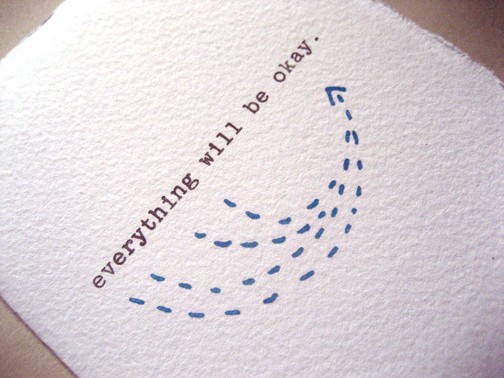
Bread + Butter Card: Everything Will Be Okay

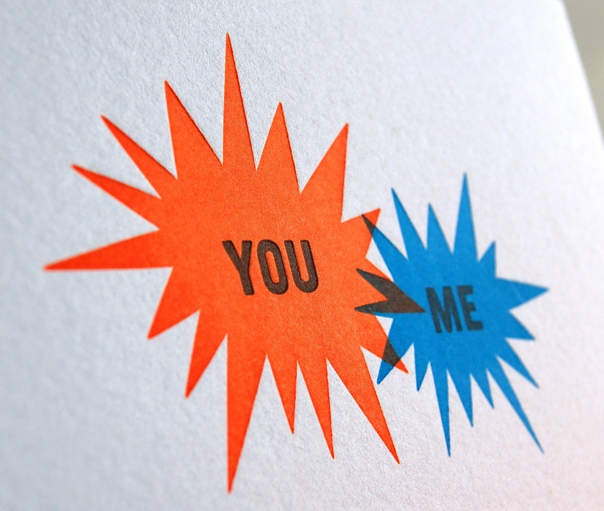
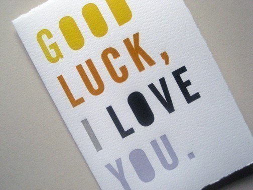
work by bread + butter studio based in brooklyn new york. love their print work.


Bread + Butter Card: Good Luck, I Love You

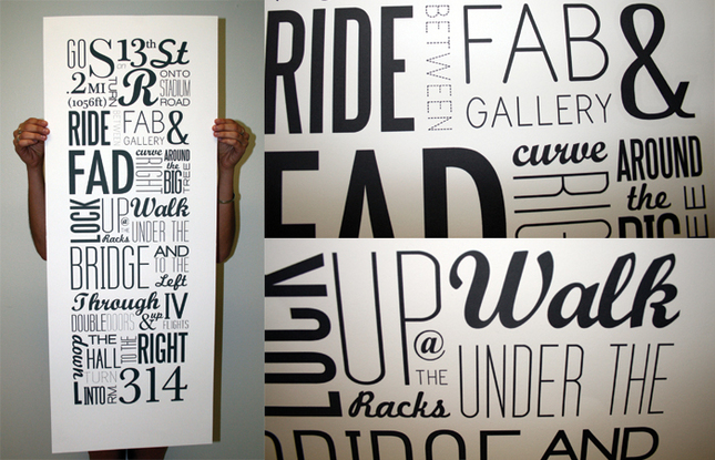
Typographic Map: 13th to 314 by Kristin Bonett

more design: related perusal and i came across this wonderful poster that is a perfect example of well set type using a milieu of typefaces in a very effective manner.
dogs as typefaces by tina roth eisenberg of swiss miss

something my friend geoff wong linked me to randomly. i find it pretty funny though some dogs are more suitable than others. univers, times, eurostile and kunstler are the best to me.

and that's my typography refuel for now.

20100323

what did we revisit: i love you more than _________


so way back last year in august i posted about some Supermarket goods that i'd like and today i came back across one of those items while flipping through design: related.

turns out that this tote is actually one of the products of a greater project called "i love you more than _________" (you read the blank as "blank") run by paperwhite studio. anyone can go onto the site and submit their own "i love you more than ________" statements.

they ask you: "what's your measuring stick for love?"

"run by Laureen Moyal and Yuliya Gorlovetsky, in New York city’s lower east side. we began this project with a belief that you can never really evaluate the value of something unless you measure it up to something else. with all the answers that we have received, we know that you must agree. keep submitting, the answers make us smile."

sounds vaguely ironic to me since you can evaluate love without measuring, but there are some really cute answers though i think their heart graphic is a little corny...

some are silly. lots are stupid. most are deeply insider things. don't really know what i would submit if i did submit something - what about you?


i still want the tote and now i kind of want the shirt but only the cards are really within my price range (and i could easily print those myself). i'm such a sucker for mushy things.

20100319

what did we peruse: design: related

design: related is my latest website of choice for random browsing while i wait for things to render / things to load / my mind to recuperate

while flipping through the gallery, which features "projects" and "inspirations" submitted by members of the site, i came across something that i knew immediately was hong kong.

Gaston Caba, based in buenos aires, made these super cute dolls and had a friend Joel Chung take photos of them in various locations in Hong Kong to be pictured in Pictoplasma Encyclopedia.

gaston caba's work is very colorful, consists mainly of bold vectors and features a great deal of cute animals and other created characters - reminds me of tokidoki and the like that you might describe as sugary-sweet. not everyone's cup of tea but there are some pretty intense patterns.

it made me smile to randomly come across a photo of hong kong when i wasn't expecting it.

20100110

what did we illustrate: daily drop cap


DAILY DROP CAP by Jessica Hische


im not sure if i've blogged about this before, but no harm. daily drop cap is a website i'm fairly certain most fans of typography have come across before - the title and tagline says it all, "an illustrative initial every day." definitely worth going through the now almost three complete sets of the alphabet. the artist puts a great deal of effort and creativity (and dilligence in commitment to the project) - some i like better than others, but that's personal preference. i also appreciate the artist's welcoming of blogging and usage.


it's an exercise that i think would be fun to try out myself, just in a sketchbook or really roughly in illustrator - a letter a day might be a bit pushing it - maybe a letter a week and that way i'd be able to go through the alphabet twice in a year...just thoughts - maybe something you'd like to attempt?


20100104

what did we browse: lookbook.nu

LOOKBOOK.nu: "And they think you should know" by Denni .: "AA Chambray Trousers, Steve Madden Shoes, Ax Dress"

first 2010 post is entirely irrelevant to the fact that it is a new year and the end of another decade. it's actually merely about this site that is very much so like
chictopia and is very much so on the mark with the latest trends: blogging and street style.

LOOKBOOK.NU


the tagline being "collective fashion consciousness" this site consists entirely of photos contributed by anyone at all who cares to make an account. looks can collect "hype" and you can browse by "new" or "hot" and see "stats" etc etc - things you're probably accustomed to navigating.

likes: some fresh/interesting outfits and some interesting/good photography

dislikes: (other than the unavoidable fair share of meh photos and looks) incredibly large amount of pretentious, pointless, ridiculous post titles....like "singing and dancing to them nighttime songs..." and "&She Red my Mind." seriously? also the inability to scroll to the bottom of the page of "hot" looks as they keep loading past ones.

p.s.: jane aldridge from sea of shoes has an account as does tavi from style rookie


LOOKBOOK.nu: "back from the dead." by Jarrod Thornley: "3d Glasses from Greater Union, Portmans Bow Tie, Flannel from Overseas, Urban Skinnies from Pumpkin Patch"


LOOKBOOK.nu: "Woman exposed pt. 2" by Celine Missoorten: "Coat, Made by Grandma, - Scarf from H"

20090928

what did we LOVE: bembo's zoo


"...the picture book debut of deVicq de Cumptich, should delight collectors of stylish picture books and aficionados of the graphic arts." - Publisher's Weekly

BEMBO'S ZOO


The entire alphabet A - Z of animals from "Antelope" to "Zebra," with things like iguanas, octopuses and flamingos in between, crafted entirely out of the Bembo typeface. It's pretty much amazing. This man (Roberto de Vicq de Cumptich) has skills beyond belief in having been able to make the likenesses of 26 animals out of the letters in their names. Recommeded for viewing by my type core studio teacher. Was a children's book before it became an entertaining flash website! Would love to own it though just clicking on the site is fairly satisfying.

20090902

what did we peruse: codes combine


on monday while scanning pages of nylon korea i came across this ad for a korean clothing company called codes combines with some fairly eye catching outfits (in my opinion) and while their site is pretty cool looking and appears easy to browse...very few links actually generate images on the screen. (hence screenshots of their intro images)
it's a strange thing.

but what i could find looks pretty good to me.


20090829

what did we search

does anyone remember my post from may 23rd "what did we invent"?

well it's reality.


TinEye is a reverse image search engine launched early this year and apparently very successful at what it does. you upload an image or plug in the image location and tineye attempts to find it wherever it exists on the interweb. it searches for the specific image uploaded and not the content in the image (which i still dream of happening one day) and their database is still quite small in comparison to the vastness of the internet's contents. but it works! (unfortunately the images i pick to search for must be far too obscure still...wish i could figure out the credits for these images...)

check out this blog post by idee (the company that created tineye) demonstrating the catching of some blatant lying regarding photo credits. this is tineye's explanatory page on the idee website.


"TinEye is like speculative fiction, that is, it meets Clarke's Third Law. 'Any sufficiently advanced technology is indistinguishable from magic.'" - David Crow