20110522
Hazel Santino
Hazel Santino's illustrations are a perfect combination of creepy, mysterious and beautiful. The time each piece must have taken is evident when examined. Hazel's oil paintings are incredibly detailed and tend towards photo realistic; she also incorporates hand done cut outs such as the branches seen in one of the pieces above. Her color palettes are musky, full of neutrals, flesh tones and swirls of greys, a nice contrast to some of the super color saturated illustrative work very popular now. Subjects in her paintings are often human though she also seems to have a enjoy rendering small animals no one else appreciates — rats and pigeons.
The content may be dark, one of the pieces above is based on the story of a murdered girl stuffed into a tree, but Hazel's treatment is far from morose or morbid. There is something quiet and thoughtful in her work. She will be beginning her fifth year at The New School this fall finishing the second of her two degrees there, a BFA in illustration at Parsons and a BA in Literary Studies at Eugene Lang. It seems as though she has already been commissioned for a couple of jobs, CD and book covers, so here's to hoping we see more of Hazel's work recognized.
Hazel's Tumblr
20110521
PRESS HERE by Hervé Tullet
I was so engaged with what was happening and the effect each turn of the page had that it hardly bothered me that I was laughing, clapping (acting a little loony) in the MoMa store. All I can say is that PRESS HERE is very compelling and makes the reader a key part of the book. The book is simply illustrated in primary colors with a raw quickly drawn style. Perusing through Tullet's equally playful site, PRESS HERE fits in very well with his body of work.
Chronicle Books released a book trailer for it as well showing children being very amused with the book. But only watch it if you’re not planning to go to a bookstore and read it because the video gives away most of what happens. And you wouldn't want to ruin reading it for yourself.
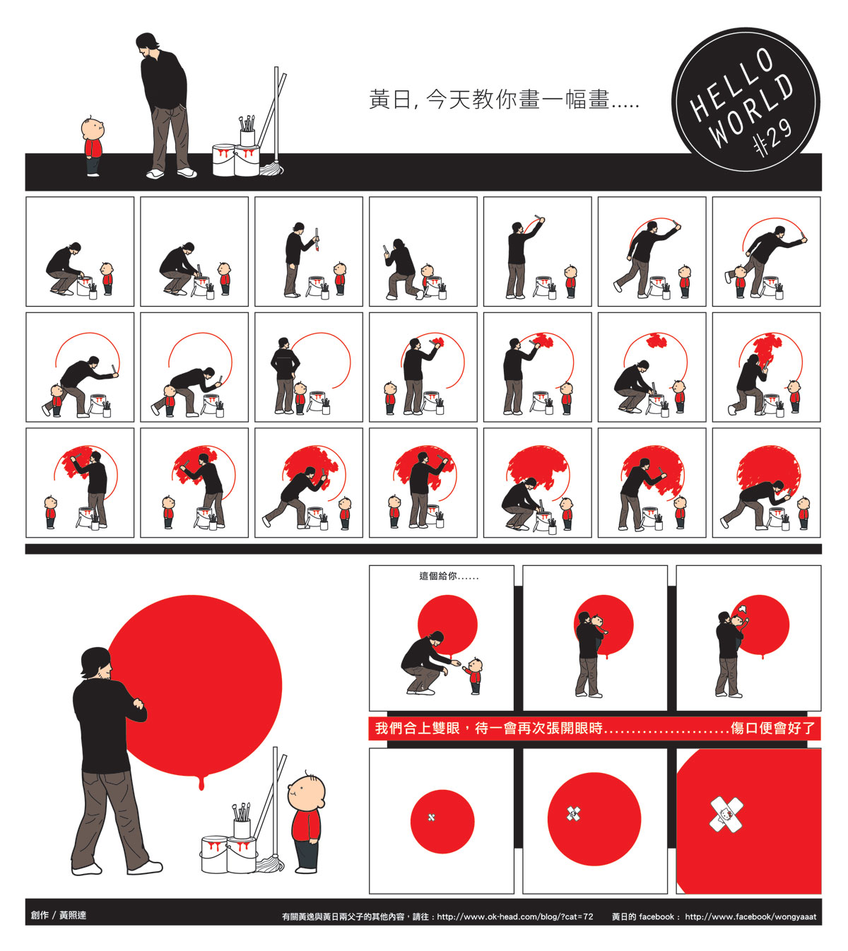
Wong Chiu Tat
Wong Chiu Tat (黃照達) is an artist whose comics are published daily by one of Hong Kong's larger newspapers, Ming Pao. His strip, called Zi Zi Za Za (translated literally) which I would translate as meaning White Noise, are typically four to six panels and comment on current social and political events. His work is a great representation of humor revealing truth; many of his strips critically analyze the Hong Kong government. Chiu Tat also recently published a book called Lonely Planet where the protagonist is a fired designer. Besides working as a professional artist, he lectures on comic and alternative art at Baptist University Hong Kong.
The blog he runs features a series of work called Hello World that consists of full pages of comics following a small boy called Wong Yut. Here, as in his strips for Ming Pao, the thoughts and reactions of the characters in the comic reflect current affairs ironically and with a grin.
My Chinese reading capability is good enough to make sense of the gist of things, but a lot of the more specific jokes and references pass me by. I enjoy the graphic style of his work without even reading the text though. It's similar to Chris Ware's work, perhaps most known for Jimmy Corrigan, the Smartest Kid on Earth. Chiu Tat's clean graphic sensibility stands out in a newspaper and is calling Hong Kong's attention to design by making it relevant to what people care about.
20101216
what did we animate: message received
Message Received from charis poon on Vimeo.
A little girl discovers something magical. (Alternative title: Old School Texting)
Created in Adobe After Effects.
Just completed my Motion Graphics 2 Final. Hurrah! A little sad I won't be taking an animation class next semester — hope I retain my knowledge of After Effects...
20101129
what did we not order: caramel brulee latte
20101123
what did we attend: mumford & sons
“Shall we have a dance?” Marcus Mumford, lead singer of Mumford and Sons asked before strumming the opening of their debut album’s first single “Little Lion Man.” The light bulbs strung above the audience flickered on and 3,000 voices roared in approval. On November 16, Mumford and Sons played the final sold-out gig of their US and Canada fall tour, “Gentlemen of the Road,” at Terminal 5 in New York. Accompanying them on this 20-date tour were King Charles, who is a Londoner with a full mane of dreads, and Cadillac Sky, a five man Texan band with a sound that is a unique blend of bluegrass, rock ‘n roll and country.20101028
what did we watch / listen to: skyence
Skyence – INSCT
Collaboration between Skyence (Hamburg) and Johannes Timpernagel (Berlin).
The animation for this video is great. I particularly enjoy the colors and intricate patterns that you only get tiny glimpses of as they pulse and you begin to wish they were on screen longer just so you could enjoy the detail in them. It's also an example of abstract motion graphics that's well done and not just flashy speedy lights and explosions.
And it's a perfect combination with the sound — which in my opinion is pretty cool stuff on its own. In fact I liked the sound design of this video so much that I've now been listening to Skyence on SoundCloud for the last hour. I don't usually listen to music without words (yeah, I realize that sometimes I'm quite musically close-minded) and I'm okay with my lyric driven songs most of the time. Discovering skyence and finding it compelling to listen to and interesting in its composition is my musical highlight of the week. Hurrah for expanding musical horizons!
20101019
what did we read: i was told there'd be cake
I have just begun reading I Was Told There'd Be Cake, Sloane Crosley's debut book published in 2008. And by just begun I mean that I have only finished reading the first essay "The Pony Problem" and almost all of the second essay. This means I'm not yet qualified to write a review of the collection and not even really certified to voice an opinion. After all, it's a collection and not just one story.
Extrapolating from what I've read so far—I'm looking forward to reading the rest of the book.
At the same time, I'm realizing the dangers of picking up a book because of really good reviews of it... Having expectations before diving into something isn't my typical approach to things, but that's how this book ended up in my Amazon cart.
The book was a best seller and, of course, on her site, there's only glowing praise. The Los Angeles Times calls it "exquisite" and Details declares it "truly well crafted and genuinely funny." Her recent second book, How Did You Get This Number?, has also accumulated solid reviews as well.
I suppose with no one saying bad things, I began this book hoping for the best and wary of being disappointed. With any luck, I'll find myself ordering How Did You Get This Number? by the end of the week.
20101018
what did we attend: mumford & sons
In a curious combination of coincidental timing and similar good taste, this fall provides me with a real life story for all long distance couples. Earlier this year, my boyfriend introduced me to the band Mumford & Sons—he really enjoys their music and I immediately loved them too. We do not often agree on what good music is. This fall, my boyfriend is currently working in LA while I'm in NYC. Tonight he is attending the first show of Mumford & Sons' tour across the States. On Tuesday, November 16 I will be attending their last show of the tour at Terminal 5 in New York.
20101004
what did we make: felt blog tracker
Blogging can be extraordinarily stressful and discouraging at times. Any one with multiple social networking platforms knows how it hectic it can be posting on a blog, a tumblr, tweeting, uploading photos on flickr, maintaining a myspace...or any of those hundreds of websites out there that can be personalized. It's crazy enough finding enough good material to put out there, making sure each one gets equal attention is pure insanity.
Which is why I've come up with this handy (and fun!) post counting calendar. All you need are a few simple materials you can get at most arts and crafts stores and a little bit of time. You'll end up with a great looking cloth and felt board that will help you visually understand your posting trends and remind yourself to post when and where. Let's get started.
- felt in the colors of the blogging platforms you want to keep track of
- felt in red and black for your weekday x's (I find red particularly reminds you to cover it up!) and yellow for your weekend x's (if you blog less on Saturdays and Sundays)
- sticky back Velcro in a strip
- wall hangers
- 2 18" stretcher bars and 2 12" stretcher bars (or whatever dimensions you want your final board to be)
- a piece of cloth large enough to cover your entire frame and have an extra 1 1/2" to fold over the frame. The piece of cloth shown here is about 22" x 15"
20101002
what did we attend: TIRED PONY
Last night my roommate and I attended the Tired Pony concert in New York. Tired Pony is Gary Lightbody, Richard Colburn, Iain Archer, Jacknife Lee, Peter Buck, Scott McCaughey and Troy Stewart. Gary Lightbody is the lead vocalist of Snow Patrol (one of my all-time favorite bands since about 6 - 7 years ago). This was Tired Pony's first gig in the United States (they'll be playing in LA on this Monday October 4) and their second in the world (the first was in London this summer). As a result of our inability to get tickets to the Snow Patrol concert sometime a little over a year ago, we immediately jumped at the chance to see Gary Lightbody in the flesh playing with Tired Pony, one of his many collaborative efforts with other amazing artists.
The concert was a great deal of solid fun. It wasn't music to get your heart pumping and feet jumping, but music to feel moved by, listen intently to and let your body move instinctively. The vocalists were entrancing, the mood dreamy and the musicians pulled off the craziest amount of instrument changes. (At any time on stage there would be somewhere between 9 - 12 different performers.) Songs were sincere and though not executed perfectly all the time, more real for the touch and go quality the performance gave it. They all had fun with each other too, really interacting and enjoying what they were doing.
Gary Lightbody exudes charisma. The man isn't actually handsome but his magnetic appeal and ability to persuade the audience to become emotionally involved with his music makes him incredibly attractive. His attitude and communication with the venue full of people was at ease and joking while his treatment of the set was serious and his singing honestly an act of complete effort and intention.
Though I entered the venue not terribly excited by the actual tunes I would be hearing, I left feeling more enthused about Tired Pony and their newly released album The Place We Ran From. The group gives off the aura that they're all in it mostly for the chance to be creative together and make good music. Their energy is definitely what still remains in my mind. I also left feeling good without any easily identifiable explanation and that sort of easy-going happy feeling is always a nice indication that the music I've just been immersed in was an experience worth trying.
I hope and hope and hope that Snow Patrol tours the United States again or that by some magic I will happen to be wherever they are performing (and have tickets).
20101001
what did we want: the quick brown fox
"This very attractively finished typographic memory game includes 25 variations of the letter ‘A’, each in a different letter type. Players attempt to find the matching A’s in the same letter type. The player who has the highest number of matching letters wins the game.
Typographic information about the letter is included on the card, and a separate folder provides a general history of the typography. This is an enjoyable and instructive game for graphic designers and anyone who is fascinated by letter types."
20100924
what did we animate
For my Motion Graphics 2 class this week we were asked to create an imaginary creature of some sort and practice parenting and expressions in Adobe After Effects while animating our creations. What I came up with was a mystical squid-fish-bird-human hybrid of some sort (tentacles, gills, wings, hands respectively) and the resulting 20 second video above of it flying quietly.
I really enjoyed character creation and would love to dabble into it more. Also, nailing parenting and expressions in AE brought me large amounts of satisfaction. Especially since before figuring it out I spent a good 4 - 5 hours not knowing at all what wasn't working.
(Parenting is the act of linking one elements movements to another - think of it as a child following his / her parent. Expressions is the same thing but with the inclusion of some intuitive "extra" movements AE tacks on to the children elements. That's how those tentacles sway without me going in and animating each individual section.)
Hope you enjoyed the video.
20100923
what did we smile because of: Yum Yum London
Which all combines together to make Yum Yum London a studio to watch out for:
"Yum Yum are Beth Algieri and Jonny Plummer, two directors / designers with a common passion for creating new and exciting things."
20100922
what did we try not to do


This project THIS YEAR I WILL TRY NOT TO was created by Elliot Scott and Christopher Doyle (two designers I didn't previously know but will now be watching out for) in an attempt to defy the popularity of certain trends on the internet and challenge themselves as designers to do new things. To not just give in to what people are comfortable with and like.

Wholly admirable and I love it for it's truth, humor and the creator's abilities to make fun of themselves. I also feel kind of shamed because even though I recognize the need to break down the typical and expand our collective comfort bubbles...I still love the things that this publication (in a very manifesto way) declares avoidance of.

And I particularly like it when designers include their process (you can view the video on their site, but not embed). It's 28 pages printed on newsprint stock - only 1000 copies and for sale for AUD $10.00 (but plus $5 for shipping to the US)
20100920
what did we feature: my instructable

Wow, so recognition online can make you feel pretty good about yourself. My instructable (which is the post below this one on this blog) was chosen to be featured on the site!
You can find "Put Insightful Text Into Your Life" on the landing page of the site or more prominently in the Living / Art channel.
Thanks Instructables Editors!
20100914
what did we make: words imposed on real life
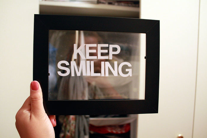
In my travels across the Internet I invariably come across really meaningful text that someone has come up with superimposed on (typically using the font Helvetica) some very pretty, abstract image of nature, city lights, a beautiful girl or otherwise gentle and mysterious photo. I can’t imagine a better way to fuse the words in your head and the things you see then by putting the two exactly on top of each other to express your deep, throbbing emotions.
Thus I decided I had to have words in real life too. How could anyone know a photo would look nice with text on it unless you were able to test it out first? Here's how you can go about putting words into your everyday lives and make them even more insightful.
All you need are:
- a couple of transparencies
- an Ikea photoframe (or any photoframe) – even multiple photoframes if you like!
- sticker letters. Make sure they’re Helvetica!
- a black sharpie. Your words don’t need color to ooze feeling.
- a pencil and scissors
1. Trace the plastic in your frame on your transparency with a pencil.
2. Have your meaningful insight ready!
3. Using your sharpie or sticker letters express your thought on the transparency however you like.
4. Cut out the transparency, put it in the frame and take as many photos with it as you please. Or just use it to make sure what you’re about to take a photo of really does look good with text placed on top of it. Bonus points for using a DSLR. Extra bonus points for using a lomography camera and then scanning it into your computer. Incredibly extra bonus points for using a polaroid camera to capture your text on the photo.Now go see your own deep thoughts in reality and imposed on images!

If you like what I had to write on my transparencies you may purchase the set of 5 for the unbeatable price of $10! If you think I’m better at this than you are then drop me an email and I’ll create your own customized set of 5 with whatever words you want!

Check out more photos on Flickr.
20100604
what did we feel compelled by: brian w. ferry
brian w. ferry is a photographer who previously resided in brooklyn and currently lives in london. his photos are fantastically mesmerizing.
i first came across his work on kitsune noir where danica describes his work as the "sort of images that pull you out of the attention deficit disorder-induced habit of compulsive clicking and compel you to pause, inhale and quietly gaze"
i agree entirely and personally think that what makes his photography so compelling is the atmosphere felt within those locations, created by half eaten plates of food and possessions - there is a quiet quality and all the things associated with that word: peace, calm, silence. however, more than being about the presence of these attributes it's the lack of frenzy, clutter and anxiety that pulls me in.
and personal. stockphotos have their place in company quarterlies and as website place holders, but this is the level of intimacy i love. a specific breakfast and someone's weekend trip.
check out his portfolio and find more images on his online journal.
20100603
what did we love: les monstris
these are the cutest handmade plushies - the artist, Ninon, who makes them calls them "Les Monstris"
not only cute, they're definitely unique from your typical stuffed toy and despite having made hundreds and hundreds of them each one remains different from the rest. it's also particularly interesting to see her go through "phases" of ideas in her craft. i wonder where she gets her abundance of fabric and materials from. it would be a nice touch to see a video or images of "les monstris in the making." summer project anyone?
in her words: "I just love making stuff with fabric and creating new little creatures. I have been doing it almost everyday since 2004. I don't really like making 2 things the same.....I am interested in failures, imperfections and in what is possible to obtain after some "mistakes". I believe that sometimes a couple of button eyes can be a lot more expressive than the eyes of many human beings..."
20100602
what did we catch up
post #276.
(#300 including non-published posts hah)
things going on with me:
i left nylon magazine the week before finals...
and i currently work in this building on the 7th floor. for the greater part of the week.
ive been listening to these albums,
and spending all my web surfing time on google reader.
i've been munching on teddy grahams and beef jerky for snacks. (not together and i do continue to eat real meals)
and im going to a sunny sunny place this weekend! (illustration by ben javens for 8th continent soy milk via lovely packaging)