Showing posts with label communications design. Show all posts

20100922

what did we try not to do


This project THIS YEAR I WILL TRY NOT TO was created by Elliot Scott and Christopher Doyle (two designers I didn't previously know but will now be watching out for) in an attempt to defy the popularity of certain trends on the internet and challenge themselves as designers to do new things. To not just give in to what people are comfortable with and like.


Wholly admirable and I love it for it's truth, humor and the creator's abilities to make fun of themselves. I also feel kind of shamed because even though I recognize the need to break down the typical and expand our collective comfort bubbles...I still love the things that this publication (in a very manifesto way) declares avoidance of.


And I particularly like it when designers include their process (you can view the video on their site, but not embed). It's 28 pages printed on newsprint stock - only 1000 copies and for sale for AUD $10.00 (but plus $5 for shipping to the US)

20100325

what did we set in type

so the fall semester of sophomore year for communication design students at parsons consists of a lot of typography work. two core classes: type studio and type lab, plus display lettering was my elective so i was basically immersed in a world of type. immersed.

this semester i have no typography classes though i will always believe that alllll design work has to do with typography. hence i don't seem to have seen so much type around.

but here's a post on typography!

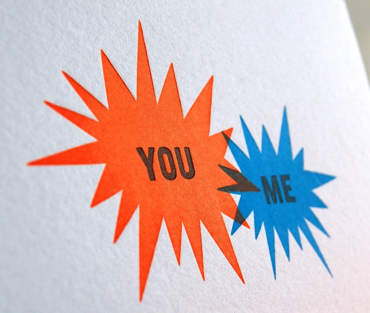
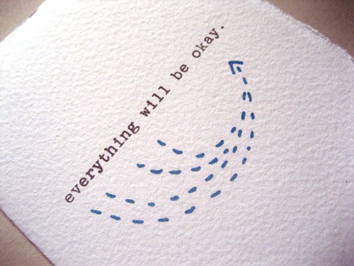
Bread + Butter Card: Everything Will Be Okay

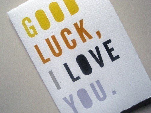
work by bread + butter studio based in brooklyn new york. love their print work.


Bread + Butter Card: Good Luck, I Love You

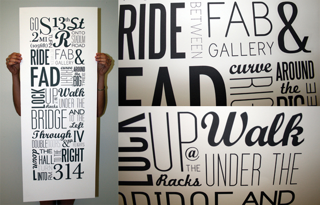
Typographic Map: 13th to 314 by Kristin Bonett

more design: related perusal and i came across this wonderful poster that is a perfect example of well set type using a milieu of typefaces in a very effective manner.
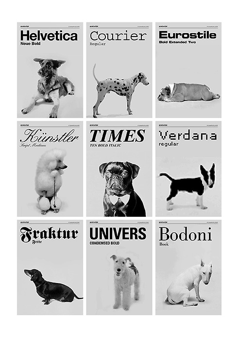
dogs as typefaces by tina roth eisenberg of swiss miss

something my friend geoff wong linked me to randomly. i find it pretty funny though some dogs are more suitable than others. univers, times, eurostile and kunstler are the best to me.

and that's my typography refuel for now.

20100315

what did we love: alex varanese


this series of graphic posters using the color orange (and red tones and white) is so gorgeous. by alex varanese originally on the behance network and which i came across on graphic-exchanGE

simple / bold colors / detailed - full of visual impact.

and more below. i couldn't resist. click above to behance or graphic exchange to see larger images.

the designer really likes reds and oranges and burnt sienna sort of looking things.


20100204

what did we express interest towards

if you're interested (whoever "you" may be), i updated my online portfolio yesterday after attending the parsons intern fair so that i could send out relevant follow up emails (thank you scot and james for your wonderful advice in the matter) with the link on them.

also: these are the five companies that i talked to, learned more about, expressed my interest towards interning for them. in the order that i talked to them yesterday.

Visionaire "is a multi-format album of fashion and art produced in exclusive numbered limited editions...artists work in collaboration with Visionaire to produce their personal interpretations on a theme and are given unparalleled freedom to push Visionaire's original formats."

BBH and ZAG "the way we work is still shaped by our central belief: that big, enduring ideas are the key to successful communications...so everything we do and all our structures support that single thought."

Hyperakt "is an independent New York City design firm with a passion for creating work that effects change in the world around us."

Stark Design "is an agency that believes in elegant, thoughtful solutions. And we know the best way to communicate clearly and create lasting, powerful messages is through simple, smart design."

Kiehl's "since 1851, our New York apothecary has been dedicated to serving discerning customers fine formulations for skin and hair made with uniquely efficacious, natural ingredients."

20090907

about food. about text.


busy of late. school started. work started.
been at nylon two days, been to all of my 6 classes (and two recitations) the other three days.


i make a pretty good sandwich
and a decent salad and for some reason have been eating a lot of eggplant.


i must be in the right major. because even when there are those around me feeling bored, feeling restless, wanting to learn something else...i really do love my classes. and my teachers. and what i will be learning. i love type and i want to be good at it.


i get the feeling i'll be working towards that. i also feel incredibly fortunate to be at nylon.
no part of me foresaw this whole summer and fall internship thing going down.

i have no appropriate commentary for "sucker."
i wouldn't mind a lollipop but i had mochi tonight and a sample of cereal milk ice cream.

20090405

what did we waste lots of time doing


crayon sculptures by diem chau

mustache pencils for boring classes anyone?
lately:

http://.szymon.tumblr.com

has been taking up my surfing the net time. and been what i flip through on "breaks" in working.

warning: if you click on the above link, i am not responsible for the time you will then spend there.

so many images are just so great and there's more random design stuff out there that you would never have discovered on your own. apparently there are some 230 pages or so....

site recommendation courtesy of christal - chasingfivetwo

20090325

what did we declare

yesterday march 24 i declared my major at parsons as communication design.

and i think i made the right choice because (partially) what i want to do with the rest of my career and life (in arts and design) is create album covers.
and make millions of posters.
and generate imaginative patterns.
and come up with new, interesting, creative fonts and play with typography and text.

and of course hopefully collaborate with other artists, names and brands on amazing work.

20090307

what did we aspire: KATIE TULLY


katie tully: type specimen poster. (HEART font) and katie tully unity font. plus handmade SCRAP book.

see this (above) is what i'd like to do with my life. organize font. arrange text. create typefaces. make books. i love the clean, sharp, simple aesthetics.

again katie tully diana+ photos.
and just a few things you might like to know about her. clearly of the high caliber quality students at parsons. a cd major! which is motivation, inspiration and food for thought for me. as i chew upon the decision of my major which must be made in - oh! eight days.

CLICK CLICK CLICK CLICK CLICK
KATIE TULLY