
this semester i have no typography classes though i will always believe that alllll design work has to do with typography. hence i don't seem to have seen so much type around.
but here's a post on typography!
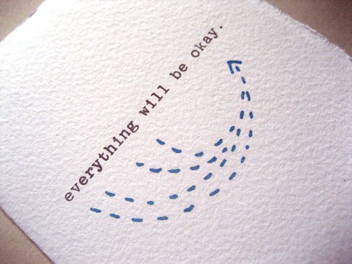 Bread + Butter Card: Everything Will Be Okay
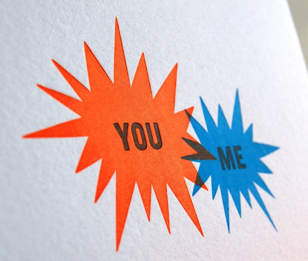
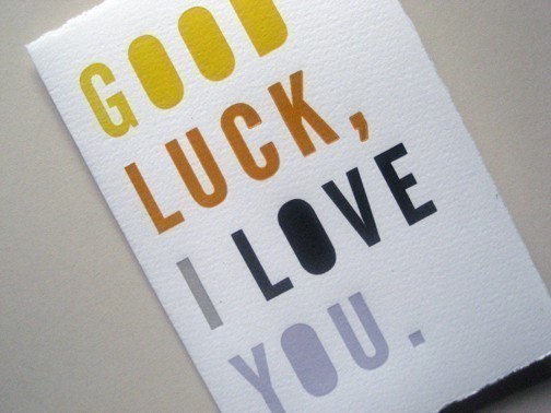
work by bread + butter studio based in brooklyn new york. love their print work.
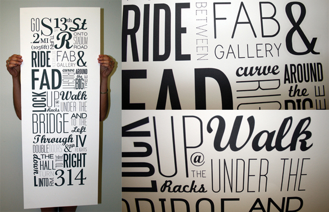
Typographic Map: 13th to 314 by Kristin Bonett
more design: related perusal and i came across this wonderful poster that is a perfect example of well set type using a milieu of typefaces in a very effective manner.
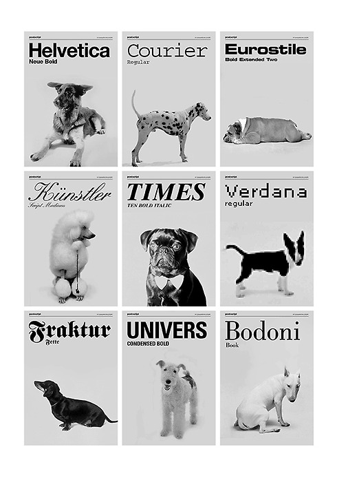 dogs as typefaces by tina roth eisenberg of swiss miss
dogs as typefaces by tina roth eisenberg of swiss misssomething my friend geoff wong linked me to randomly. i find it pretty funny though some dogs are more suitable than others. univers, times, eurostile and kunstler are the best to me.
and that's my typography refuel for now.
and that's my typography refuel for now.

No comments:
Post a Comment